Standard View
- This article is a incomplete. It is missing detail about critical functions, or contains a number of red links. You can help the JRiver Wiki by expanding it.
Standard View is one of the five primary View Modes of Media Center, and is the main interface that is used for basic navigation and operation of the application. It is designed to be used from a desktop computer with a mouse and keyboard, but you can control the size of the interface elements to make it work on touchscreen devices as well. This is where you will perform all of your setup, media and metadata management, and all other functions of the application. Standard View is the "primary interface" of Media Center.
Sections
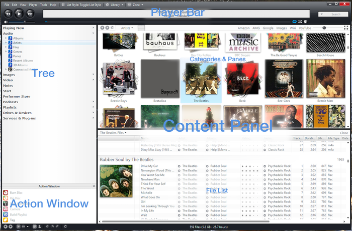
It has four main sections which are arranged like so:
These are:
In most view types, the Content Panel is itself composed of two separate sub-panels:
Divider Bars
- See also: Divider Bars
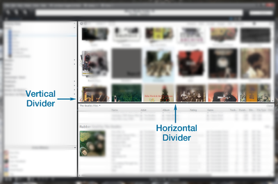
Standard View is divided into its sections by a set of two independent Divider Bar controls. These movable dividers are similar to those you may have seen in other applications. These bars can be dragged, from anywhere along its length, in order to resize the individual sections.
The vertical bar divides the Tree and Action Window on the left, and the Content Panel on the right. The horizontal bar is only shown in views for which the Content Panel shows two sub-sections, as opposed to views with a header and file listing only (such as Playlists or Podcasts). When available, the horizontal bar divides the Categories and Panes on top, and the File Listing below.
Toolbars
In addition, Standard View has customizable top and bottom toolbars, which can be used to "pin" buttons for a variety of useful functions.
In the Windows versions of Media Center, the top toolbar contains the File, Edit, View, and other drop-down menus, while on the Mac version the top toolbar is empty of all but the standard window controls (as the drop-down menus are integrated into the OS menu bar). The bottom Toolbar contains a flexible status display, which lists the number of files shown in any selected view, and other information about current processes in Media Center (such as background tagging operations). To these, you can add your own set of buttons that provide quick access to a variety of functions within MC.
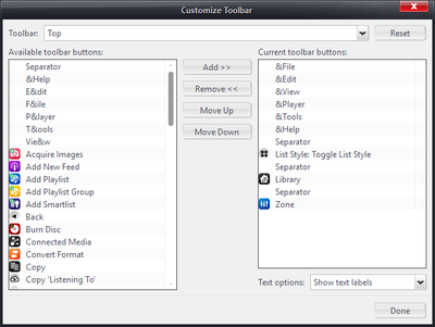
To customize the toolbars, right click on one of them and choose Customize Toolbar to open the Customize Toolbar dialog.
This dialog allows you to choose which buttons to display in each Toolbar, and rearrange the items displayed. You can also add Separators to divide buttons up into groups (as shown in the screenshots above). If you use multiple Libraries or Zones, you may want to add the corresponding buttons to one of your toolbars, as they provide a quick way to switch between your different Zones or Libraries. Other useful buttons include:
- Back and Forward
- Refresh
- Playing Now
- Rotation commands for images
- Navigation


