Divider Bars: Difference between revisions
No edit summary |
No edit summary |
||
| (2 intermediate revisions by the same user not shown) | |||
| Line 1: | Line 1: | ||
{{See also|Standard View}} |
{{See also|Standard View}} |
||
Standard View is divided into its sections by a set of two independent Divider Bar controls. These movable dividers are similar to those you may have seen in other applications. These bars can be dragged, from anywhere along its length, in order to resize the individual sections |
Standard View is divided into its sections by a set of two independent [[Divider Bar]] controls. These movable dividers are similar to those you may have seen in other applications. These bars can be dragged, from anywhere along its length, in order to resize the individual sections. |
||
* The vertical bar divides the [[Tree]] and [[Action Window]] on the left, and the [[Content Panel]] on the right. |
|||
* The horizontal bar divides the sections of the [[Content Panel]]. It is only shown in views for which the Content Panel shows two sub-sections, as opposed to views with a header and file listing only (such as [[Playlists]] or [[Podcasts]]). When available, the horizontal bar divides the [[Categories and Panes]] on top, and the [[File Listing]] below. |
|||
<gallery widths=460px heights=300px> |
<gallery widths=460px heights=300px> |
||
Latest revision as of 04:59, 6 May 2015
- See also: Standard View
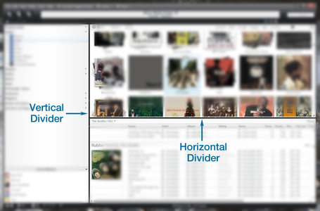
Standard View is divided into its sections by a set of two independent Divider Bar controls. These movable dividers are similar to those you may have seen in other applications. These bars can be dragged, from anywhere along its length, in order to resize the individual sections.
- The vertical bar divides the Tree and Action Window on the left, and the Content Panel on the right.
- The horizontal bar divides the sections of the Content Panel. It is only shown in views for which the Content Panel shows two sub-sections, as opposed to views with a header and file listing only (such as Playlists or Podcasts). When available, the horizontal bar divides the Categories and Panes on top, and the File Listing below.
Each bar also contains a set of arrows that can be clicked to completely hide the section, or restore it from a hidden position. The direction of the arrow indicates whether clicking it will hide the section, or restore it. You can also drag the divider bars to or away from the "edge" of the application to hide or restore that section. The one exception to this is that the Tree/Action Window section cannot be hidden by dragging the vertical bar, though you can use the arrows to hide it completely (this is to keep users from accidentally hiding the entire Tree control with an errant mouse drag).
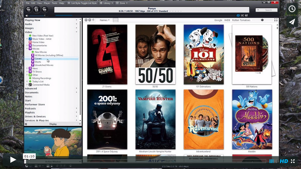
Here is a brief demo of this functionality on both OSX and Windows versions of Media Center:


