Standard View Skinning Tutorial: Difference between revisions
No edit summary |
No edit summary |
||
| (70 intermediate revisions by 4 users not shown) | |||
| Line 1: | Line 1: | ||
'''MC Skinning Tutorial– Standard View''' |
|||
Skinning is customization of the software User Interface. It is based on graphics and simple coding instructions to determine how the program looks and acts. Anyone can be a skinner and create custom interfaces for MEDIA CENTER to share with the MC community or for personal use. |
Skinning is customization of the software User Interface. It is based on graphics and simple coding instructions to determine how the program looks and acts. Anyone can be a skinner and create custom interfaces for MEDIA CENTER to share with the MC community or for personal use. |
||
| Line 12: | Line 10: | ||
Therefore, in order to skin MC you have to modify: |
|||
• A set of images (frame, buttons, sliders etc.) |
• A set of images (frame, buttons, sliders etc.) |
||
| Line 26: | Line 24: | ||
When you download J. River MEDIA CENTER the application is contained in various folders that reside on your PC hard drive. All Standard View skins are found in the MegaSkins folder in this location: |
When you download J. River MEDIA CENTER the application is contained in various folders that reside on your PC hard drive. All Standard View skins are found in the MegaSkins folder in this location: |
||
C:\Program Files\J River\Media Center |
C:\Program Files (x86)\J River\Media Center 19\Skins\Standard View |
||
You can navigate to this folder by right-clicking on your Windows Start button and selecting Explore. In the MegaSkins folder you will see that each skin has its own folder. For example, there is a folder entitled Aruba, and this contains all the elements that form the Aruba skin (graphics and xml file). |
You can navigate to this folder by right-clicking on your Windows Start button and selecting Explore. In the MegaSkins folder you will see that each skin has its own folder. For example, there is a folder entitled Aruba, and this contains all the elements that form the Aruba skin (graphics and xml file). |
||
| Line 79: | Line 77: | ||
6. Save the changes to the main.xml file, and then take the whole TekNik folder and put it back in the MegaSkins folder here: |
6. Save the changes to the main.xml file, and then take the whole TekNik folder and put it back in the MegaSkins folder here: |
||
C:\Program Files\J River\Media Center |
C:\Program Files (x86)\J River\Media Center 19\Skins\Standard View |
||
Now, when you open up the MEDIA CENTER software, the TekNik skin will be listed as an independent skin (of course, it will still look exactly like Noire, because you haven’t changed any images yet, but you have given it your chosen name and taken the first step to creating your very own skin. |
Now, when you open up the MEDIA CENTER software, the TekNik skin will be listed as an independent skin (of course, it will still look exactly like Noire, because you haven’t changed any images yet, but you have given it your chosen name and taken the first step to creating your very own skin. |
||
'''The complete Standard View TekNik skin is available for download on the skins download page:''' |
|||
[http://accessories.jriver.com/mediacenter/accessories.php] |
|||
| Line 88: | Line 89: | ||
The TekNik folder sitting on your desktop is your working skin. I suggest backing it up to another location regularly as your skin progresses, so that you don’t lose the fruit of your hard work by mistake. As you make changes to this desktop folder, simply copy it (not transfer) into the MegaSkins folder to see the results. Skin changes do not take effect until either the program is closed and reopened or you go the Toolbar in the open program and reselect the skin you are working on. |
The TekNik folder sitting on your desktop is your working skin. I suggest backing it up to another location regularly as your skin progresses, so that you don’t lose the fruit of your hard work by mistake. As you make changes to this desktop folder, simply copy it (not transfer) into the MegaSkins folder to see the results. Skin changes do not take effect until either the program is closed and reopened or you go the Toolbar in the open program and reselect the skin you are working on. |
||
Open the TekNik folder. You can see that most of the image files are .png files. This is a good file format to use because it supports transparency, which can give you some cool effects in the skin such as smooth edges, curves and gradients. Use image editing software that supports png files. I use PhotoShop, but there are many others to choose from. All images can be .png (recommended), but in this skin there are some .bmp images too. Where this is the case a color has to be designated as transparent (this is set in the main.xml file for each element). We usually use a bright pink or some color that won’t be used in the skin. |
Open the TekNik folder. You can see that most of the image files are .png files. This is a good file format to use because it supports transparency, which can give you some cool effects in the skin such as smooth edges, curves and gradients. Use image editing software that supports png files. I use PhotoShop, but there are many others to choose from. All images can be .png (recommended), but in this skin there are some .bmp images too. Where this is the case, a color has to be designated as transparent (this is set in the main.xml file for each element). We usually use a bright pink or some color that won’t be used in the skin. Where you see images in this tutorial with pink, that color is transparent and does not show in the application. However, if you change the pink color shade even slightly, it is no longer deemed transparent by the program and will show in your skin. |
||
As you look through the list of images in the folder, you will see that |
As you look through the list of images in the folder, you will see that many graphics (not all) are named for the areas of Standard View in which you will find them. These areas include: |
||
Action Window – bottom left area where key user tasks are shown |
Action Window – bottom left area where key user tasks are shown |
||
Tree - Organization Tree on the left side of the program |
|||
Frame – when a skinned window such as the Options dialog box opens up, it uses these graphics to draw the frame. |
Frame – when a skinned window such as the Options dialog box opens up, it uses these graphics to draw the frame. |
||
Groupbox - these often form part of a dialog box |
|||
List – the area on the right where track details are shown |
List – the area on the right where track details are shown |
||
| Line 106: | Line 111: | ||
Scrollbar – wherever horizontal or vertical scrollbars show up |
Scrollbar – wherever horizontal or vertical scrollbars show up |
||
Screenshot of Standard View with key areas identified |
|||
[[Image:MC12parts.png]] |
[[Image:MC12parts.png]] |
||
| Line 115: | Line 123: | ||
Now to change the image. I want to create a flatter and less shiny player with a metallic look. This image can be as plain and simple as a rectangle or you can make it more interesting by adding such elements as bevels and curved edges, and by experimenting with different textures. Whatever you do, the great thing about skinning MC is that you can change your mind and rework a graphic until you are satisfied with it. |
Now to change the image. I want to create a flatter and less shiny player with a metallic look. This image can be as plain and simple as a rectangle or you can make it more interesting by adding such elements as bevels and curved edges, and by experimenting with different textures. Whatever you do, the great thing about skinning MC is that you can change your mind and rework a graphic until you are satisfied with it. |
||
Noire MainFrame_TopBorder.bmp |
|||
[[Image:MainFrame_TopBorder.png]] |
|||
TekNik MainFrame_TopBorder.bmp |
|||
[[Image:MainFrame_TopBorder2.png]] |
|||
As you develop this graphic, keep in mind the Mini View of the MEDIA CENTER application. The Mini View can use the same or a modified version of this image as its background. By default MC will use MainFrame_TopBorder.bmp to generate the Mini View player, but if you want to modify it (to, say, give it curved edges on the bottom or even an entirely new look) then it needs to be saved separately as Slimview.png. |
As you develop this graphic, keep in mind the Mini View of the MEDIA CENTER application. The Mini View can use the same or a modified version of this image as its background. By default MC will use MainFrame_TopBorder.bmp to generate the Mini View player, but if you want to modify it (to, say, give it curved edges on the bottom or even an entirely new look) then it needs to be saved separately as Slimview.png. |
||
Look through all the images in the folder and decide which ones you want to change, and then replace them with your own. This can be a little time consuming, but if you work methodically, you can see the skin evolve into your own unique creation. |
Look through all the images in the folder and decide which ones you want to change, and then replace them with your own. This can be a little time consuming, but if you work methodically, you can see the skin evolve into your own unique creation. |
||
'''The importance of the main.xml document''' |
|||
The main.xml document is laid out to identify different areas of the application. It is divided into sections, such as MAINFRAME, PLAYERBAR and ACTION WINDOW to show where it interacts with a certain part of the player. Where it indicates a particular image by name it will also indicate the variables that pertain to that image. Variables such as number of states, how that image stretches, any transparent color associated with that image. This is also where many text and background color changes are made. It is good to become familar with this document as you will find yourself referring to it quite often. |
|||
| Line 139: | Line 161: | ||
All states of the image are on one graphic (mostly to reduce the number of images that need to be managed). If the image has 3 states, the graphic will be divided into 3 equal parts and each image state must align correctly in its box or you will get unwanted movement of the button as you mouseover or press it. |
All states of the image are on one graphic (mostly to reduce the number of images that need to be managed). If the image has 3 states, the graphic will be divided into 3 equal parts and each image state must align correctly in its box or you will get unwanted movement of the button as you mouseover or press it. |
||
Noire Play button [[Image:Playerbar_PlayButton.png]] |
|||
TekNik Play button [[Image:Playerbar_PlayButton2.png]] |
|||
The number of states of an image is set in the main.xml document next to the name of the graphic. In the xml code below, the NumberImages sets the states to 5. |
The number of states of an image is set in the main.xml document next to the name of the graphic. In the xml code below, the NumberImages sets the states to 5. |
||
| Line 152: | Line 174: | ||
As you create new images, you will have to think about the color of text that may sit on that graphic. I created a darker display area image (PlayerBar_Display.png), so I had to go to the main.xml file and change the color of the text so that it would show properly |
As you create new images, you will have to think about the color of text that may sit on that graphic. I created a darker display area image for TekNik(PlayerBar_Display.png), so I had to go to the main.xml file and change the color of the text so that it would show properly |
||
Noire PlayerBar Display |
|||
<PlayerBar display graphic> |
|||
[[Image:PlayerBar_Display.png]] |
|||
TekNik PlayerBar Display |
|||
Text color can have a number of states too. For example, the Toolbar menu text color in the main.xml This text has numerous color states options that can be set in the main.xml (normal color, highlighted color (as you mouseover) and selected text color for the drop-down menus). |
|||
[[Image:PlayerBar_Display2.png]] |
|||
Text color can have a number of states too. For example, the Toolbar menu text color in the main.xml This text has numerous color states options that can be set in the main.xml (normal color, highlighted color (as you mouseover) and selected text color for the drop-down menus). |
|||
'''Rating (stars)''' |
'''Rating (stars)''' |
||
| Line 167: | Line 194: | ||
3. Rating selection view |
3. Rating selection view |
||
Noire Ratings Stars [[Image:List_Rating.png]] |
|||
TekNik Ratings Stars [[Image:List_Rating2.png]] |
|||
'''Understanding layers''' |
|||
In this case, I simply re-colored the graphic to fit my skin. |
|||
'''Understanding layered images''' |
|||
When working with the graphics, be aware that you might have to consider several elements that sit on top of each other, and work together to perform a function. An example is the volume level control. In this skin it consists of 3 images. A background image that is the bottom layer (PlayerBar_SliderPos.png), another image that is revealed as you increase the volume (PlayerBar_SliderVolFront.png), and a graphic that is the button you use to physically slide the volume control (PlayerBar_SliderVolThumb.png). The progress bar uses similar images. |
When working with the graphics, be aware that you might have to consider several elements that sit on top of each other, and work together to perform a function. An example is the volume level control. In this skin it consists of 3 images. A background image that is the bottom layer (PlayerBar_SliderPos.png), another image that is revealed as you increase the volume (PlayerBar_SliderVolFront.png), and a graphic that is the button you use to physically slide the volume control (PlayerBar_SliderVolThumb.png). The progress bar uses similar images. |
||
Noire SliderVol images: |
|||
PlayerBar_SliderVol.png |
PlayerBar_SliderVol.png |
||
| Line 176: | Line 210: | ||
PlayerBar_SliderVolFront.png |
PlayerBar_SliderVolFront.png |
||
[[Image: |
[[Image:PlayerBar_SliderVolFront.png]] |
||
PlayerBar_SliderVolThumb |
PlayerBar_SliderVolThumb |
||
[[Image: |
[[Image:PlayerBar_SliderVolThumb.png]] |
||
I decided to |
I decided to revise the Close button, and also change the number of states that this button has, so in main.xml, in the MAINFRAME section and the specific line that refers to the Close button: |
||
Name="CloseButton" Bitmap="Close.png" NumberImages="5" Alignment="2" OffsetX="-3" OffsetY="1" /> |
Name="CloseButton" Bitmap="Close.png" NumberImages="5" Alignment="2" OffsetX="-3" OffsetY="1" /> |
||
I changed the number images to NumberImages="3" |
I changed the number images to NumberImages="3" |
||
Noire Close button (with 5 states) |
|||
[[Image:Close.png]] |
|||
TekNik Close button (with 3 states) |
|||
[[Image:Close2.png]] |
|||
Buttons, like other graphic elements are assigned a default position, but they can be moved by setting some parameters in the main.xml document. Values of Y move the item vertically, and values of X move the item horizontally. |
Buttons, like other graphic elements are assigned a default position, but they can be moved by setting some parameters in the main.xml document. Values of Y move the item vertically, and values of X move the item horizontally. |
||
| Line 192: | Line 233: | ||
If your buttons flicker as you mouseover them it may mean that your graphics are not correctly aligned in each state of the button. A mere pixel off can do this. |
If your buttons flicker as you mouseover them it may mean that your graphics are not correctly aligned in each state of the button. A mere pixel off can do this. |
||
When changing the color of a graphic be aware that you might have to also change the color of any text that shows up on that image so that it can be seen clearly. The place to make those color changes is in the main.xml document. An example here is the search box. For the TekNik skin I decided on a dark background and found that the existing gray text was not very visible, so I had to choose a lighter color. |
When changing the color of a graphic be aware that you might have to also change the color of any text that shows up on that image so that it can be seen clearly. The place to make those color changes is in the main.xml document. An example here is the search box. For the TekNik skin I decided on a dark background and found that the existing gray text was not very visible, so I had to choose a lighter color. In the main.xml document, I looked in the PLAYERBAR section and edited this code: |
||
<Entry Name="Search" Bitmap="Playerbar_Search.png" Margins="10,6,10,6" OffsetY="51"> |
|||
<Colors Text="acacac" SelectedText="f0f4fd" SelectedBack="005fff" /> |
|||
Colors Text="acacac" defines the color of the search bar text, with "acacac" being the actual color chosen. |
|||
| Line 199: | Line 246: | ||
http://www.jessett.com/web_sites/html/hex_colours.shtml |
http://www.jessett.com/web_sites/html/hex_colours.shtml |
||
The main.xml document is laid out to identify different areas of the application. Where it indicates a particular image by name it will also indicate the variables that pertain to that image. Variables such as number of states, how that image stretches, any transparent color associated with that image |
|||
Skin the splitter bars. These are bars in the program that allow you to resize windows. There is a horizontal Splitter and a vertical Splitter image that can be skinned. |
|||
As you go through the skinning process it is a good idea to check the program at each stage to make sure that everything is working correctly. Even small typing mistakes can make a feature fail to function. If something isn’t working, retrace your steps. Look for missing files, wrongly named files or typos in the main.xml. |
As you go through the skinning process it is a good idea to check the program at each stage to make sure that everything is working correctly. Even small typing mistakes can make a feature fail to function. If something isn’t working, retrace your steps. Look for missing files, wrongly named files or typos in the main.xml. |
||
'''Important''' I’ll keep repeating this advice. Always back up your work at each stage of development! |
|||
TheSkin.jpg. Create a screenshot of your skin in Standard View. This ships with the skin and shows when you are changing skins in the Skin Manager and also is displayed on the website when users are looking at skins to download. Make the image 300 pixels wide. |
|||
'''The Progress bar''' |
|||
This progress bar is seen in the Action Window during Burning and Ripping functions, and other places where a feature lets you visually track the progress of a particular process. It consists of 2 images, a background image and another image that sits on top of it and moves to indicate the extent of the progress. |
|||
Noire Progress Bar images [[Image:Progress_Back.png]] [[Image:Progress_Front.png]] |
|||
TekNik Progress Bar images [[Image:Progress_Back2.png]] [[Image:Progress_Front2.png]] |
|||
As you can see, I have left the Back image the same, but changed the front image with a more suitable color. I also decided to use transparency in the png file, so the background image would show through and provide an interesting visual effect. |
|||
'''Splitter bars''' |
|||
These are bars in the program that allow you to resize windows. There is a horizontal Splitter and a vertical Splitter image that can be skinned. |
|||
'''Dialog Box graphics''' |
|||
There are many dialog boxes that open in the software as you use different features. Look in the FRAME section of the main.xml to identify the images that are associated with dialogs. |
|||
Typical Dialog Box |
|||
[[Image:DialogBox.png]] |
|||
Other dialog boxes may use additional elements. Once you begin to recognize what the different graphics do, you'll see them appear throughout the program. |
|||
[[Image:ViewScheme.png]] |
|||
'''Slider images''' |
|||
Slider images appear in areas of the program like the DSP dialog box for controlling sound effects. They can move horizontally or vertically depending on their use. |
|||
[[Image:DSP.png]] |
|||
'''Tabs''' |
|||
There are several types of tabs in the application. One type of tab is found in the Skin Manager utility. |
|||
[[Image:TabGraphics.png]] |
|||
Another type of tab is found when you open the Split View feature. |
|||
[[Image:SplitViewTab.png]] |
|||
'''Scrollbars''' |
|||
Keeping in mind my idea for a flatter design for my skin, I reworked the scrollbar graphics to fit my skin. Remember to do both vertical and horizontal scrollbars. |
|||
Noire scrollbar images [[Image:Scrollbar_VerticalHandle.png]] [[Image:Scrollbar_VerticalBackground.png]] [[Image:Scrollbar_VerticalDownArrow.png]] [[Image:Scrollbar_VerticalUpArrow.png]] |
|||
TekNik scrollbar images [[Image:Scrollbar_VerticalHandle2.png]] [[Image:Scrollbar_VerticalBackground2.png]] [[Image:Scrollbar_VerticalDownArrow2.png]] [[Image:Scrollbar_VerticalUpArrow2.png]] |
|||
'''Background selection images''' |
|||
There are areas in the Standard View interface where you can select items from a list. These include The Organization Tree, Menu, Action Window, Options dialog box and Content list. You can use images to set backgrounds for each of these selections. If no image is present, a default color is assigned for the background and is changable in the main.xml document. These backgrounds can have a number of states. For example, the Organization Tree selection image has 3 states - Selected, Moused-over and Inactive. The images below look too tall to fit the selection areas, but the program resizes them according to where they are needed. |
|||
Tree Selection image for Noire |
|||
[[Image:Tree_Selection.png]] |
|||
Tree Selection image for TekNik |
|||
[[Image:Tree_Selection2.png]] |
|||
'''Radio buttons and checkboxes''' |
|||
Radio Buttons and checkboxes are used frequently in the software. One place to test your new images quickly is in the Scheduler feature in the Organization Tree (under Services & Plug-ins). Just click on the Add Task button to get the following dialog box (TekNik skin shown): |
|||
[[Image:SchedulerTask.png]] |
|||
Here you can also see elements that form the combobox for drop-down menus. |
|||
'''TheSkin.jpg''' |
|||
Create a screenshot of your skin in Standard View. This ships with the skin and shows when you are changing skins in the Skin Manager and also is displayed on the website when users are looking at skins to download. Make the image 300 pixels wide. |
|||
[[Image:TheSkin.jpg]] |
|||
Finally, once you feel that you skin is complete and you want to share it, submit it to the J. River MEDIA CENTER website. See '''Third Party Plug-ins, Programs, and Skins''' in the Interact forum. |
|||
http://accessories.musicex.com/mediacenter/submitplugin.php |
|||
This submit form is for other plug-ins as well as skin submissions, so please make sure you enter the correct info. If you have questions, please ask on Interact. |
|||
---- |
|||
'''Other Resources''' |
|||
For skinning ideas and inspiration, you can check out the following sites: |
|||
http://www.winamp.com |
|||
http://www.SkinBase.org |
|||
http://www.winmodify.com |
|||
http://www.wincustomize.com. |
|||
For discussion about MC skinning, please visit the Interact forum at: |
|||
http://yabb.jriver.com/interact/index.php?board=5.0 |
|||
[http://yabb.jriver.com/interact/index.php?topic=72790.msg493173#msg493173 Skinnable Frames and Borders] |
|||
[[Category:Skinning]] |
|||
<<TUTORIAL INCOMPLETE. CHECK BACK LATER>> |
|||
[[Category:Tutorials]] |
|||
Latest revision as of 05:43, 4 May 2015
Skinning is customization of the software User Interface. It is based on graphics and simple coding instructions to determine how the program looks and acts. Anyone can be a skinner and create custom interfaces for MEDIA CENTER to share with the MC community or for personal use.
Intro
The easiest way to create your own Standard View skin for J. River MEDIA CENTER is to modify an existing one. You can skin absolutely everything or select only certain parts to change.
Skinning involves making or altering image files to create the graphic buttons, frames, and icons etc. that appear on the software. As well as working with images, some modification of an xml file is required. Xml is a coding language and looks similar to html code. It controls things like image placement, colors of elements, stretching of elements, and so forth. The xml file may look daunting at first, but it is quite straight-forward once you understand how it is laid out. The various graphic elements of the player are placed in default positions, and this only changes if modifications are made to the xml file.
Therefore, in order to skin MC you have to modify:
• A set of images (frame, buttons, sliders etc.)
• The main.xml document for your particular skin
Knowing where stuff goes
So, where are these images and xml file? When you download J. River MEDIA CENTER the application is contained in various folders that reside on your PC hard drive. All Standard View skins are found in the MegaSkins folder in this location:
C:\Program Files (x86)\J River\Media Center 19\Skins\Standard View
You can navigate to this folder by right-clicking on your Windows Start button and selecting Explore. In the MegaSkins folder you will see that each skin has its own folder. For example, there is a folder entitled Aruba, and this contains all the elements that form the Aruba skin (graphics and xml file).
Software tools required for making a skin
You will need a graphics program (Photoshop, Paint Shop Pro, GIMP or even the simple paint program that came with your PC). You will also need a text editor, such as Notepad (included free with your Windows PC) to make changes to the xml file.
TIP Here is a link to info about free image editing software:
http://graphicssoft.about.com/od/pixelbasedwin/tp/freephotoedw.htm
Want something a little more powerful than standard Notepad? Try Notepad++, a free source code editor:
http://notepad-plus.sourceforge.net/uk/site.htm
Important I’ll keep repeating this advice. Always back up your work at each stage of development!
If you want to use elements of a skin created by someone else, it is good etiquette to ask permission. At the very least give them credit in your skin description. Some skinners are very protective of their work, and copyright laws may come into play.
Getting started
So where to start? First, pick a skin you want to use for modification. For this tutorial I will use the Noire skin, but any existing skin will do.
1.
1. Navigate to the Noire skin folder.
2. Make a copy of the folder, and put it on your PC desktop.
3. Rename the folder with your new skin name, for example, TekNik
4. Open the folder and in amongst the many image files, you will find the main.xml file. Open the file with text editing software, such as Notepad, MS FrontPage etc.
5. For Noire, the top lines of the xml will read thus:
<MJMS version="3.0">
<SKIN Name="Noire" Author="Pixtudio" EMail="infor@pixtudio.com" WebSite="http://www.pixtudio.com" About="Copyright Pixtudio" />
Here you need to add your own details between the quote marks: <MJMS version="3.0">
<SKIN Name="TekNik" Author=" YOURNAME " EMail="YOUREMAIL" WebSite="YOURWEBSITE" About="Copyright YOURNAME" />
6. Save the changes to the main.xml file, and then take the whole TekNik folder and put it back in the MegaSkins folder here:
C:\Program Files (x86)\J River\Media Center 19\Skins\Standard View
Now, when you open up the MEDIA CENTER software, the TekNik skin will be listed as an independent skin (of course, it will still look exactly like Noire, because you haven’t changed any images yet, but you have given it your chosen name and taken the first step to creating your very own skin.
The complete Standard View TekNik skin is available for download on the skins download page: [1]
2.
The TekNik folder sitting on your desktop is your working skin. I suggest backing it up to another location regularly as your skin progresses, so that you don’t lose the fruit of your hard work by mistake. As you make changes to this desktop folder, simply copy it (not transfer) into the MegaSkins folder to see the results. Skin changes do not take effect until either the program is closed and reopened or you go the Toolbar in the open program and reselect the skin you are working on.
Open the TekNik folder. You can see that most of the image files are .png files. This is a good file format to use because it supports transparency, which can give you some cool effects in the skin such as smooth edges, curves and gradients. Use image editing software that supports png files. I use PhotoShop, but there are many others to choose from. All images can be .png (recommended), but in this skin there are some .bmp images too. Where this is the case, a color has to be designated as transparent (this is set in the main.xml file for each element). We usually use a bright pink or some color that won’t be used in the skin. Where you see images in this tutorial with pink, that color is transparent and does not show in the application. However, if you change the pink color shade even slightly, it is no longer deemed transparent by the program and will show in your skin.
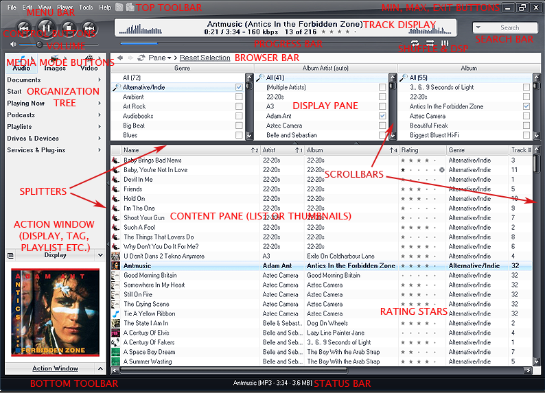
As you look through the list of images in the folder, you will see that many graphics (not all) are named for the areas of Standard View in which you will find them. These areas include:
Action Window – bottom left area where key user tasks are shown
Tree - Organization Tree on the left side of the program
Frame – when a skinned window such as the Options dialog box opens up, it uses these graphics to draw the frame.
Groupbox - these often form part of a dialog box
List – the area on the right where track details are shown
MainFrame - this is the outside border of Standard View
Menu – the drop down menus of the program
Playerbar - the top area that contains currently playing track, and play controls
Scrollbar – wherever horizontal or vertical scrollbars show up
Screenshot of Standard View with key areas identified
Working with images
You can start modifying or replacing any image to begin, but let’s take a key one and start with that. I’ll take the MainFrame_TopBorder.bmp and open it up in my image editing software. In MC images are layered on top of each other to achieve the overall look. The MainFrame_TopBorder.bmp is, as its name suggests, the top part of the main frame and it is the background over which other elements such as play controls, track info, and volume and progress sliders are layered
Now to change the image. I want to create a flatter and less shiny player with a metallic look. This image can be as plain and simple as a rectangle or you can make it more interesting by adding such elements as bevels and curved edges, and by experimenting with different textures. Whatever you do, the great thing about skinning MC is that you can change your mind and rework a graphic until you are satisfied with it.
Noire MainFrame_TopBorder.bmp
TekNik MainFrame_TopBorder.bmp
As you develop this graphic, keep in mind the Mini View of the MEDIA CENTER application. The Mini View can use the same or a modified version of this image as its background. By default MC will use MainFrame_TopBorder.bmp to generate the Mini View player, but if you want to modify it (to, say, give it curved edges on the bottom or even an entirely new look) then it needs to be saved separately as Slimview.png.
Look through all the images in the folder and decide which ones you want to change, and then replace them with your own. This can be a little time consuming, but if you work methodically, you can see the skin evolve into your own unique creation.
The importance of the main.xml document
The main.xml document is laid out to identify different areas of the application. It is divided into sections, such as MAINFRAME, PLAYERBAR and ACTION WINDOW to show where it interacts with a certain part of the player. Where it indicates a particular image by name it will also indicate the variables that pertain to that image. Variables such as number of states, how that image stretches, any transparent color associated with that image. This is also where many text and background color changes are made. It is good to become familar with this document as you will find yourself referring to it quite often.
Buttons
Buttons are an important part of skinning, and nice buttons can greatly enhance a skin design. There are graphics for each button in the program (Play, Pause, Next, Previous, Minimize, Maximize, Shuffle etc.). When you look at the button graphics, you will notice that they are actually comprised of several images. These are referred to as “States” of the button, and each state will appear depending on what you are doing with the button (mousing over it, pressing it, if the button has been disabled, and so on).
Sometimes there are fewer states (3 are very common) and sometimes more, and, typically, the button states follow this sequence from left to right:
1. Normal
2. Over (as in moused-over)
3. Pressed
4. Disabled
5. Clickable mouseover area (might be used of you want to highlight only certain areas of the button as you mouseover it.
All states of the image are on one graphic (mostly to reduce the number of images that need to be managed). If the image has 3 states, the graphic will be divided into 3 equal parts and each image state must align correctly in its box or you will get unwanted movement of the button as you mouseover or press it.
The number of states of an image is set in the main.xml document next to the name of the graphic. In the xml code below, the NumberImages sets the states to 5.
<Entry Name="PlayButton" Bitmap="PlayerBar_PlayButton.png" NumberImages="5" />
As well as a Next, Play and Back control button, be sure to create a Stop button as well. MC does not show it by default, but some users prefer to have one. It will remain invisible until it is turned on through the program Toolbar > Options > General > Show Stop button.
Important I’ll keep repeating this advice. Always back up your work at each stage of development!
As you create new images, you will have to think about the color of text that may sit on that graphic. I created a darker display area image for TekNik(PlayerBar_Display.png), so I had to go to the main.xml file and change the color of the text so that it would show properly
Text color can have a number of states too. For example, the Toolbar menu text color in the main.xml This text has numerous color states options that can be set in the main.xml (normal color, highlighted color (as you mouseover) and selected text color for the drop-down menus).
Rating (stars)
The rating graphic has 3 states:
1. No rating
2. Normal rated
3. Rating selection view
TekNik Ratings Stars ![]() In this case, I simply re-colored the graphic to fit my skin.
In this case, I simply re-colored the graphic to fit my skin.
Understanding layered images
When working with the graphics, be aware that you might have to consider several elements that sit on top of each other, and work together to perform a function. An example is the volume level control. In this skin it consists of 3 images. A background image that is the bottom layer (PlayerBar_SliderPos.png), another image that is revealed as you increase the volume (PlayerBar_SliderVolFront.png), and a graphic that is the button you use to physically slide the volume control (PlayerBar_SliderVolThumb.png). The progress bar uses similar images.
Noire SliderVol images:
I decided to revise the Close button, and also change the number of states that this button has, so in main.xml, in the MAINFRAME section and the specific line that refers to the Close button:
Name="CloseButton" Bitmap="Close.png" NumberImages="5" Alignment="2" OffsetX="-3" OffsetY="1" />
I changed the number images to NumberImages="3"
Noire Close button (with 5 states)
![]()
TekNik Close button (with 3 states)
![]()
Buttons, like other graphic elements are assigned a default position, but they can be moved by setting some parameters in the main.xml document. Values of Y move the item vertically, and values of X move the item horizontally.
If your buttons flicker as you mouseover them it may mean that your graphics are not correctly aligned in each state of the button. A mere pixel off can do this.
When changing the color of a graphic be aware that you might have to also change the color of any text that shows up on that image so that it can be seen clearly. The place to make those color changes is in the main.xml document. An example here is the search box. For the TekNik skin I decided on a dark background and found that the existing gray text was not very visible, so I had to choose a lighter color. In the main.xml document, I looked in the PLAYERBAR section and edited this code:
<Entry Name="Search" Bitmap="Playerbar_Search.png" Margins="10,6,10,6" OffsetY="51">
<Colors Text="acacac" SelectedText="f0f4fd" SelectedBack="005fff" />
Colors Text="acacac" defines the color of the search bar text, with "acacac" being the actual color chosen.
Text and background colors in the main.xml are written in hexadecimal. These consist of six digits and can be numbers or letters or a combination. For example, white is ffffff and black is 000000 and lime green is 33ff66. There are lots of websites like this one that have hex color charts:
http://www.jessett.com/web_sites/html/hex_colours.shtml
As you go through the skinning process it is a good idea to check the program at each stage to make sure that everything is working correctly. Even small typing mistakes can make a feature fail to function. If something isn’t working, retrace your steps. Look for missing files, wrongly named files or typos in the main.xml.
Important I’ll keep repeating this advice. Always back up your work at each stage of development!
The Progress bar
This progress bar is seen in the Action Window during Burning and Ripping functions, and other places where a feature lets you visually track the progress of a particular process. It consists of 2 images, a background image and another image that sits on top of it and moves to indicate the extent of the progress.
As you can see, I have left the Back image the same, but changed the front image with a more suitable color. I also decided to use transparency in the png file, so the background image would show through and provide an interesting visual effect.
Splitter bars
These are bars in the program that allow you to resize windows. There is a horizontal Splitter and a vertical Splitter image that can be skinned.
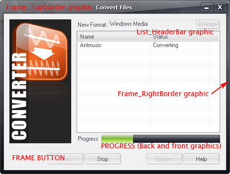
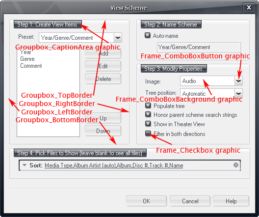
Dialog Box graphics
There are many dialog boxes that open in the software as you use different features. Look in the FRAME section of the main.xml to identify the images that are associated with dialogs.
Typical Dialog Box
Other dialog boxes may use additional elements. Once you begin to recognize what the different graphics do, you'll see them appear throughout the program.
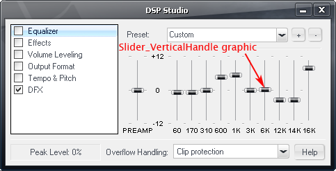
Slider images
Slider images appear in areas of the program like the DSP dialog box for controlling sound effects. They can move horizontally or vertically depending on their use.
Tabs
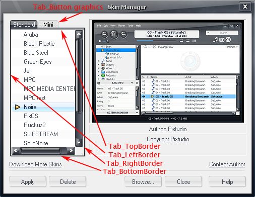
There are several types of tabs in the application. One type of tab is found in the Skin Manager utility.
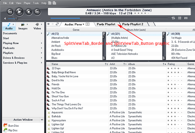
Another type of tab is found when you open the Split View feature.
Scrollbars
Keeping in mind my idea for a flatter design for my skin, I reworked the scrollbar graphics to fit my skin. Remember to do both vertical and horizontal scrollbars.
Background selection images
There are areas in the Standard View interface where you can select items from a list. These include The Organization Tree, Menu, Action Window, Options dialog box and Content list. You can use images to set backgrounds for each of these selections. If no image is present, a default color is assigned for the background and is changable in the main.xml document. These backgrounds can have a number of states. For example, the Organization Tree selection image has 3 states - Selected, Moused-over and Inactive. The images below look too tall to fit the selection areas, but the program resizes them according to where they are needed.
Tree Selection image for Noire
Tree Selection image for TekNik
Radio buttons and checkboxes
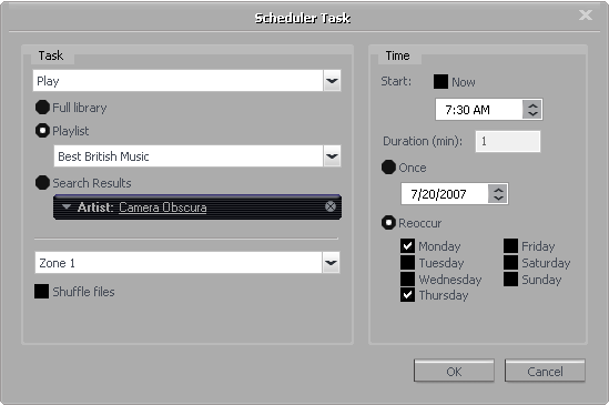
Radio Buttons and checkboxes are used frequently in the software. One place to test your new images quickly is in the Scheduler feature in the Organization Tree (under Services & Plug-ins). Just click on the Add Task button to get the following dialog box (TekNik skin shown):
Here you can also see elements that form the combobox for drop-down menus.
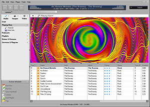
TheSkin.jpg
Create a screenshot of your skin in Standard View. This ships with the skin and shows when you are changing skins in the Skin Manager and also is displayed on the website when users are looking at skins to download. Make the image 300 pixels wide.
Finally, once you feel that you skin is complete and you want to share it, submit it to the J. River MEDIA CENTER website. See Third Party Plug-ins, Programs, and Skins in the Interact forum.
http://accessories.musicex.com/mediacenter/submitplugin.php
This submit form is for other plug-ins as well as skin submissions, so please make sure you enter the correct info. If you have questions, please ask on Interact.
Other Resources
For skinning ideas and inspiration, you can check out the following sites:
For discussion about MC skinning, please visit the Interact forum at:
