Playing Now Popup: Difference between revisions
No edit summary |
|||
| (9 intermediate revisions by 3 users not shown) | |||
| Line 1: | Line 1: | ||
[[File:PNPopup.jpg]] |
|||
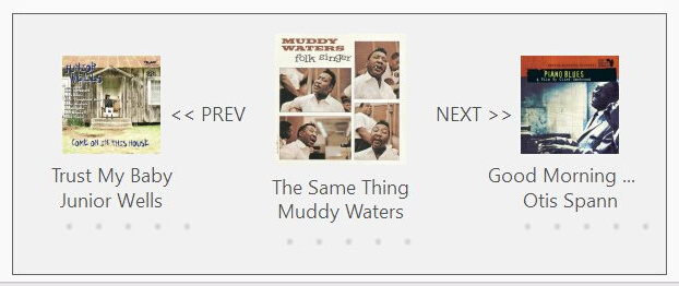
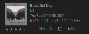
The Playing Now Popup introduced in MC 33 automatically displays track information when the currently playing track changes. Pressing Ctrl+i on the keyboard will display the popup manually. The amount of time it shows for and other display properties can be edited in the settings accessed through Tools > Options > General > Interface > Playing Now Popup or by clicking on the popup and selecting Settings from the menu. The content and layout is defined by a skin file and there are some built-in skins to choose from (selected in the popup settings). You can also create a custom skin. |
The Playing Now Popup introduced in MC 33 automatically displays track information when the currently playing track changes. Pressing Ctrl+i on the keyboard will display the popup manually. The amount of time it shows for and other display properties can be edited in the settings accessed through Tools > Options > General > Interface > Playing Now Popup or by clicking on the popup and selecting Settings from the menu. The content and layout is defined by a skin file and there are some built-in skins to choose from (selected in the popup settings). You can also create a custom skin. |
||
| Line 64: | Line 66: | ||
| ''Border'' |
| ''Border'' |
||
| draws border around window |
| draws border around window |
||
:"no", "yes", or <nowiki>"yes||WIDTH||COLOR"</nowiki> (color specified as above) |
|||
| "no" |
|||
:example: "yes||2||ff0000" |
|||
| "no", width of 1, Standard View text color |
|||
|- |
|- |
||
| ''MouseBehavior'' |
| ''MouseBehavior'' |
||
| Line 99: | Line 103: | ||
| ''Type'' |
| ''Type'' |
||
| type of content |
| type of content |
||
: "text", "image", "ratings", or " |
: "text", "image", "ratings", "time", or "volume" |
||
| |
| |
||
|} |
|} |
||
| Line 165: | Line 169: | ||
|- |
|- |
||
| ''Command'' |
| ''Command'' |
||
| command executed when clicked, " |
| command executed when clicked, "MCC_COMMAND, PARAMETER" |
||
: example for Next: "10003,0" |
: example for Next: "10003,0" |
||
: |
|||
[index] can be used for PARAMETER. which substitutes the track index given by TrackOffset |
|||
: example: "10015,[index]" |
|||
: |
: |
||
special command that pops up list of tracks, "showtracks" or "showtracks||SHOWNUMBERS||TRACKEXPRESSION" |
special command that pops up list of tracks, "showtracks" or "showtracks||SHOWNUMBERS||TRACKEXPRESSION" |
||
| Line 190: | Line 197: | ||
| playback states when the image will be hidden |
| playback states when the image will be hidden |
||
: example: "0,1" |
: example: "0,1" |
||
:: where 0=stopped, 1=paused, 2=playing, 3=waiting |
:: where 0=stopped, 1=paused, 2=playing, 3=waiting, 100=mute_on, 101=mute_off |
||
| |
| |
||
|} |
|} |
||
| Line 219: | Line 226: | ||
: {r} - remaining time<br/> |
: {r} - remaining time<br/> |
||
: {t} - total time |
: {t} - total time |
||
:: |
:: example: "{e} / {t}" |
||
| style="width: 10%"| |
| style="width: 10%"| |
||
|- |
|- |
||
| Line 227: | Line 234: | ||
|} |
|} |
||
==== "volume" type ==== |
|||
{| class="wikitable" style="width: 85%;" |
|||
! Attribute !! Description !! Default |
|||
|- |
|||
| style="width: 15%"| ''BackImage'' |
|||
| style="width: 75%"| Specifies the image(s) used for the slider background (only first 1 required, parameters are as specified in Standard View skin), <nowiki>"IMAGES_FILE||NUM_IMAGES||IMAGE_SCALE||MARGINS"</nowiki><br/> |
|||
: example: <nowiki>"./Playerbar_SliderVol.png||4||2||5,14,5,0"</nowiki> |
|||
| style="width: 10%"| Uses volume slider images from Standard View |
|||
|- |
|||
|''FrontImage'' |
|||
| Specifies the image(s) used for the slider front, see above |
|||
: example: <nowiki>"./Playerbar_SliderVolFront.png||4||4||30,1,30,1"</nowiki> |
|||
| Uses volume slider images from Standard View |
|||
|- |
|||
|''ThumbImage'' |
|||
| Specifies the image(s) used for the slider thumb/handle, see above |
|||
: example: <nowiki>"./Playerbar_SliderVolThumb.png||4||2"</nowiki> |
|||
| Uses volume slider images from Standard View |
|||
|} |
|||
==== Special expression strings ==== |
==== Special expression strings ==== |
||
| Line 245: | Line 271: | ||
|} |
|} |
||
==== OS-specific values ==== |
|||
You can have OS-specific values if the default ones are not working well on platforms that you did not design the skin on. This is particularly useful for text and fonts. Add a child element to ContentItem named "Windows", "Mac", or "Linux" and override any of the default attributes. For example, for a different font in Mac you could have something like this: |
|||
:<ContentItem Type="Text" Name="TrackName" x="248" y="2" Width="100" Height="13" Text="[Name]" FontFace="Segoe UI" FontSize="13" > |
|||
::<Mac FontFace="Helvetica" FontSize="10" /> |
|||
:</ContentItem> |
|||
[[Category: Frequently Asked Questions]] |
[[Category: Frequently Asked Questions]] |
||
Latest revision as of 15:18, 20 November 2024
The Playing Now Popup introduced in MC 33 automatically displays track information when the currently playing track changes. Pressing Ctrl+i on the keyboard will display the popup manually. The amount of time it shows for and other display properties can be edited in the settings accessed through Tools > Options > General > Interface > Playing Now Popup or by clicking on the popup and selecting Settings from the menu. The content and layout is defined by a skin file and there are some built-in skins to choose from (selected in the popup settings). You can also create a custom skin.
Custom Skin Creation
To make a new custom skin, create a new folder under "[MC_PROGRAM_FOLDER]\Skins\Playing Now Popup". For example, create "C:\Program Files\J River\Media Center 33\Skins\Playing Now Popup\My New Skin". A file named main.xml is required in the new folder to define the popup so either create one or copy one from a built-in skin.
Skin Example, "Control"
<MJPS version="1.0">
  <SKIN Name="Control" Author="JRiver" />
  <POPUP>
    <Settings Width="300" Height="115" BackImage="" BackColor="" Border="yes" />
    <ContentItem Type="image" Name="Thumbnail" X="15" Y="10" Width="75" Height="75" Source="[Large]" />
    <ContentItem Type="text" Name="Name" X="100" Y="10" Width="195" Height="15" Text="[Name]" FontStyle="bold" />
    <ContentItem Type="text" Name="Artist" X="100" Y="27" Width="195" Height="15" Text="[Artist]" />
    <ContentItem Type="text" Name="Album" X="100" Y="44" Width="195" Height="15" Text="[Album]" />
    <ContentItem Type="text" Name="Details" X="100" Y="61" Width="195" Height="15"
                 Text="[pn_position] of [pn_count] - [Duration] - [File Type] - [Bit Depth]//[Sample Rate]" />
    <ContentItem Type="rating" Name="Rating" X="15" Y="88" Width="100" Height="15"/>
    <ContentItem Type="image" Name="Previous" X="115" Y="78" Width="35" Height="35"
                 Source="{PlayerBar,PreviousButton,0}||{PlayerBar,PreviousButton,1}||{PlayerBar,PreviousButton,2}"
                 Tooltip="Previous: Char(10) [Name] by [Artist]" Command="10004,0" TrackOffset="-1"/>
    <ContentItem Type="image" Name="Play" X="150" Y="78" Width="35" Height="35"
                 Source="{PlayerBar,PlayButton,0}||{PlayerBar,PlayButton,1}||{PlayerBar,PlayButton,2}"
                 Tooltip="Play" Command="10000" HideStates="2,3" />
    <ContentItem Type="image" Name="Pause" X="150" Y="78" Width="35" Height="35"
                 Source="{PlayerBar,PauseButton,0}||{PlayerBar,PauseButton,1}||{PlayerBar,PauseButton,2}"
                 Tooltip="Pause" Command="10000" HideStates="0,1" />
    <ContentItem Type="image" Name="Stop" X="185" Y="78" Width="35" Height="35"
                 Source="{PlayerBar,StopButton,0}||{PlayerBar,StopButton,1}||{PlayerBar,StopButton,2}"
                 Tooltip="Stop" Command="10002"/>
    <ContentItem Type="image" Name="Next" X="220" Y="78" Width="35" Height="35"
                 Source="{PlayerBar,NextButton,0}||{PlayerBar,NextButton,1}||{PlayerBar,NextButton,2}"
                 Tooltip="Next: Char(10) [Name] by [Artist]" Command="10003,0" TrackOffset="1" />
  </POPUP>
</MJPS>
Skin Reference
<Settings>
This element is required and specifies global settings for the popup.
| Attribute | Description | Default |
|---|---|---|
| Width | overall window width | |
| Height | overall window height | |
| BackImage | image used as the background
|
|
| BackColor | color used as background
|
Standard View dialog background color |
| Border | draws border around window
|
"no", width of 1, Standard View text color |
| MouseBehavior | specifies how mouse behaves over images
|
"0" |
<ContentItem>
One or more of these elements defines the content displayed.
Required attributes
| Attribute | Description | Default |
|---|---|---|
| X | horizontal position of top left corner | |
| Y | vertical position of top left corner | |
| Width | item width | |
| Height | item height | |
| Type | type of content
|
"text" type
| Attribute | Description | Default |
|---|---|---|
| Text | expression that gets evaluated and displayed as text | |
| Tooltip | expression that gets evaluated and displayed as a tooltip when hovering over the text | |
| TrackOffset | track number offset from current track to evaluate expression, can be negative | "0" |
| FontFace | font name | Standard View's font name |
| FontSize | size/height of font | Standard View's font size |
| FontStyle | "bold", "italic", or "bold,italic" | Standard View's font style |
| TextColor | specific color expressed as "rrggbb" (e.g. "ffffff" for white) | Standard View's text color |
| HAlign | horizontal alignment of text
|
"left" |
| VAlign | vertical alignment of text
|
"top" |
| TooltipOptions | options for the tooltip of the form "BACK_COLOR,TEXT_COLOR,BORDER_COLOR,ALPHA", where colors are specified as above and alpha specifies the background transparency (10-255)
|
"image" type
| Attribute | Description | Default |
|---|---|---|
| Tooltip | expression that gets evaluated and displayed as a tooltip when hovering over the image | |
| TrackOffset | track number offset from current track for thumbnail and tooltip, can be negative | "0" |
| Command | command executed when clicked, "MCC_COMMAND, PARAMETER"
[index] can be used for PARAMETER. which substitutes the track index given by TrackOffset
special command that pops up list of tracks, "showtracks" or "showtracks||SHOWNUMBERS||TRACKEXPRESSION"
|
|
| Source | up to 3 images (only 1 required) specified like so: "NORMAL||HOVER||PUSH" Source types:
2) file name, "./image.png"
3) Standard View skin image, "{SECTION,IMAGENAME,IMAGE#}"
|
|
| TooltipOptions | options for the tooltip of the form "BACK_COLOR,TEXT_COLOR,BORDER_COLOR,ALPHA", where colors are specified as above and alpha specifies the background transparency (10-255)
| |
| HideStates | playback states when the image will be hidden
|
"ratings" type
- Note the Width attribute is ignored and is calculated from all the images laid out horizontally with the specified Height.
| Attribute | Description | Default |
|---|---|---|
| StarImages | Specifies the images used for the rating stars (3 required), "IMG_UNSTARRED||IMG_STARRED||IMG_CHANGESTAR"
|
Uses rating star images from Standard View |
| ClearImages | Specifies the images used for clearing the rating (2 required), "IMG_CLEAR_NORMAL||IMG_CLEAR_OVER"
|
Uses clear rating images from Standard View |
"time" type
| Attribute | Description | Default |
|---|---|---|
| Text | template that gets filled with current playback times
|
|
| Other "text" type attributes are the same |
"volume" type
| Attribute | Description | Default |
|---|---|---|
| BackImage | Specifies the image(s) used for the slider background (only first 1 required, parameters are as specified in Standard View skin), "IMAGES_FILE||NUM_IMAGES||IMAGE_SCALE||MARGINS"
|
Uses volume slider images from Standard View |
| FrontImage | Specifies the image(s) used for the slider front, see above
|
Uses volume slider images from Standard View |
| ThumbImage | Specifies the image(s) used for the slider thumb/handle, see above
|
Uses volume slider images from Standard View |
Special expression strings
| String | Description |
|---|---|
| [pn_count] | displays number of tracks in Playing Now |
| [pn_position] | displays playing track number |
| [pn_mcversion] | displays the current MC program version |
| Char(10) | inserts a line break |
OS-specific values
You can have OS-specific values if the default ones are not working well on platforms that you did not design the skin on. This is particularly useful for text and fonts. Add a child element to ContentItem named "Windows", "Mac", or "Linux" and override any of the default attributes. For example, for a different font in Mac you could have something like this:
- <ContentItem Type="Text" Name="TrackName" x="248" y="2" Width="100" Height="13" Text="[Name]" FontFace="Segoe UI" FontSize="13" >
- <Mac FontFace="Helvetica" FontSize="10" />
- </ContentItem>

